Sliced Baseball Home Runs
Jim Gruman
July 27, 2021
Last updated: 2021-10-11
Checks: 7 0
Knit directory: myTidyTuesday/
This reproducible R Markdown analysis was created with workflowr (version 1.6.2). The Checks tab describes the reproducibility checks that were applied when the results were created. The Past versions tab lists the development history.
Great! Since the R Markdown file has been committed to the Git repository, you know the exact version of the code that produced these results.
Great job! The global environment was empty. Objects defined in the global environment can affect the analysis in your R Markdown file in unknown ways. For reproduciblity it’s best to always run the code in an empty environment.
The command set.seed(20210907) was run prior to running the code in the R Markdown file. Setting a seed ensures that any results that rely on randomness, e.g. subsampling or permutations, are reproducible.
Great job! Recording the operating system, R version, and package versions is critical for reproducibility.
Nice! There were no cached chunks for this analysis, so you can be confident that you successfully produced the results during this run.
Great job! Using relative paths to the files within your workflowr project makes it easier to run your code on other machines.
Great! You are using Git for version control. Tracking code development and connecting the code version to the results is critical for reproducibility.
The results in this page were generated with repository version 2ef046e. See the Past versions tab to see a history of the changes made to the R Markdown and HTML files.
Note that you need to be careful to ensure that all relevant files for the analysis have been committed to Git prior to generating the results (you can use wflow_publish or wflow_git_commit). workflowr only checks the R Markdown file, but you know if there are other scripts or data files that it depends on. Below is the status of the Git repository when the results were generated:
Ignored files:
    Ignored:    .Rhistory
    Ignored:    .Rproj.user/
    Ignored:    catboost_info/
    Ignored:    data/2021-10-11/
    Ignored:    data/CNHI_Excel_Chart.xlsx
    Ignored:    data/CommunityTreemap.jpeg
    Ignored:    data/Community_Roles.jpeg
    Ignored:    data/YammerDigitalDataScienceMembership.xlsx
    Ignored:    data/accountchurn.rds
    Ignored:    data/acs_poverty.rds
    Ignored:    data/advancedaccountchurn.rds
    Ignored:    data/airbnbcatboost.rds
    Ignored:    data/australiaweather.rds
    Ignored:    data/baseballHRxgboost.rds
    Ignored:    data/baseballHRxgboost2.rds
    Ignored:    data/fmhpi.rds
    Ignored:    data/grainstocks.rds
    Ignored:    data/hike_data.rds
    Ignored:    data/nber_rs.rmd
    Ignored:    data/netflixTitles.rmd
    Ignored:    data/netflixTitles2.rds
    Ignored:    data/spotifyxgboost.rds
    Ignored:    data/spotifyxgboostadvanced.rds
    Ignored:    data/us_states.rds
    Ignored:    data/us_states_hexgrid.geojson
    Ignored:    data/weatherstats_toronto_daily.csv

Untracked files:
    Untracked:  analysis/CHN_1_sp.rds
    Untracked:  analysis/sample data for r test.xlsx
    Untracked:  code/YammerReach.R
    Untracked:  code/work list batch targets.R
Note that any generated files, e.g. HTML, png, CSS, etc., are not included in this status report because it is ok for generated content to have uncommitted changes.
These are the previous versions of the repository in which changes were made to the R Markdown (analysis/2021_07_27_sliced.Rmd) and HTML (docs/2021_07_27_sliced.html) files. If you’ve configured a remote Git repository (see ?wflow_git_remote), click on the hyperlinks in the table below to view the files as they were in that past version.
| File | Version | Author | Date | Message |
|---|---|---|---|---|
| Rmd | 2ef046e | opus1993 | 2021-10-11 | adopt common color scheme |
Season 1 Episode 9 of #SLICED features a Major League Baseball challenge to predict whether a batter’s hit results in a home run. Each row represents a unique pitch and ball in play. The evaluation metric for submissions in this competition is classification mean logloss.

SLICED is like the TV Show Chopped but for data science. The four competitors get a never-before-seen dataset and two-hours to code a solution to a prediction challenge. Contestants get points for the best model plus bonus points for data visualization, votes from the audience, and more.
The audience is invited to participate as well. This file consists of my submissions with cleanup and commentary added.
To make the best use of the resources that we have, we will explore the data set for features to select those with the most predictive power, build a random forest to confirm the recipe, and then build one or more ensemble models. If there is time, we will craft some visuals for model explainability.
Let’s load up packages:
suppressPackageStartupMessages({
library(tidyverse) # clean and transform rectangular data
library(hrbrthemes) # plot theming

library(tidymodels) # machine learning tools
library(finetune) # racing methods for accelerating hyperparameter tuning

library(themis) # ml prep tools for handling unbalanced datasets
library(baguette) # ml tools for bagged decision tree models

library(vip) # interpret model performance
library(DALEXtra)

})

source(here::here("code","_common.R"),
       verbose = FALSE,
       local = knitr::knit_global())

ggplot2::theme_set(theme_jim(base_size = 12))

#create a data directory
data_dir <- here::here("data",Sys.Date())
if (!file.exists(data_dir)) dir.create(data_dir)

# set a competition metric
mset <- metric_set(mn_log_loss)

# set the competition name from the web address
competition_name <- "sliced-s01e09-playoffs-1"

zipfile <- paste0(data_dir,"/", competition_name, ".zip")

path_export <- here::here("data",Sys.Date(),paste0(competition_name,".csv"))
Get the Data
A quick reminder before downloading the dataset: Go to the web site and accept the competition terms!!!
For more on other ways of predicting baseball stats, check out David Robinson’s book, Introduction to Empirical Bayes, Examples from Baseball Statistics!
We have basic shell commands available to interact with Kaggle here:
# from the Kaggle api https://github.com/Kaggle/kaggle-api

# the leaderboard
shell(glue::glue("kaggle competitions leaderboard { competition_name } -s"))

# the files to download
shell(glue::glue("kaggle competitions files -c { competition_name }"))

# the command to download files
shell(glue::glue("kaggle competitions download -c { competition_name } -p { data_dir }"))

# unzip the files received
shell(glue::glue("unzip { zipfile } -d { data_dir }"))
We are reading in the contents of the three datafiles here, unnesting the id_artists column, joining the artists table to each id of the artists, cleaning the genres text, and finally collapsing the genres back.
park_dimensions <- read_csv(file = glue::glue(
  {
    data_dir
  },
  "/park_dimensions.csv"
))

train_df <- read_csv(file = glue::glue(
  {
    data_dir
  },
  "/train.csv"
)) %>%
  left_join(park_dimensions, by = "park") %>%
  mutate(across(ends_with("_team"), as_factor)) %>%
  mutate(across(ends_with("_name"), as_factor)) %>%
  mutate(across(ends_with("_id"), as_factor)) %>%
  mutate(across(ends_with("is_"), as_factor)) %>%
  mutate(Cover = as_factor(Cover)) %>%
  mutate(bb_type = as_factor(bb_type)) %>%
  mutate(bearing = as_factor(bearing)) %>%
  select(is_home_run, everything()) %>%
  mutate(is_home_run = factor(if_else(is_home_run == 1, "yes", "no"))) %>%
  janitor::clean_names()

holdout_df <- read_csv(file = glue::glue(
  {
    data_dir
  },
  "/test.csv"
)) %>%
  left_join(park_dimensions, by = "park") %>%
  mutate(across(ends_with("_team"), as_factor)) %>%
  mutate(across(ends_with("_name"), as_factor)) %>%
  mutate(across(ends_with("_id"), as_factor)) %>%
  mutate(across(ends_with("is_"), as_factor)) %>%
  mutate(Cover = as_factor(Cover)) %>%
  mutate(bb_type = as_factor(bb_type)) %>%
  mutate(bearing = as_factor(bearing)) %>%
  janitor::clean_names()
Some questions to answer here: What features have missing data, and imputations may be required? What does the outcome variable look like, in terms of imbalance?
skimr::skim(train_df)Outcome variable is_home_run is a binary class. bb_type, launch_speed, and launch_angle are missing some data. We will take a closer look at what missingness means in this context.
Outcome Variable Distribution
summarize_is_home_run <- function(tbl) {
ret <- tbl %>%
summarize(
n_is_home_run = sum(is_home_run == "yes"),
n = n(),
.groups = "drop"
) %>%
arrange(desc(n)) %>%
mutate(
pct_is_home_run = n_is_home_run / n,
low = qbeta(.025, n_is_home_run + 5, n - n_is_home_run + .5),
high = qbeta(.975, n_is_home_run + 5, n - n_is_home_run + .5)
) %>%
mutate(pct = n / sum(n))
ret
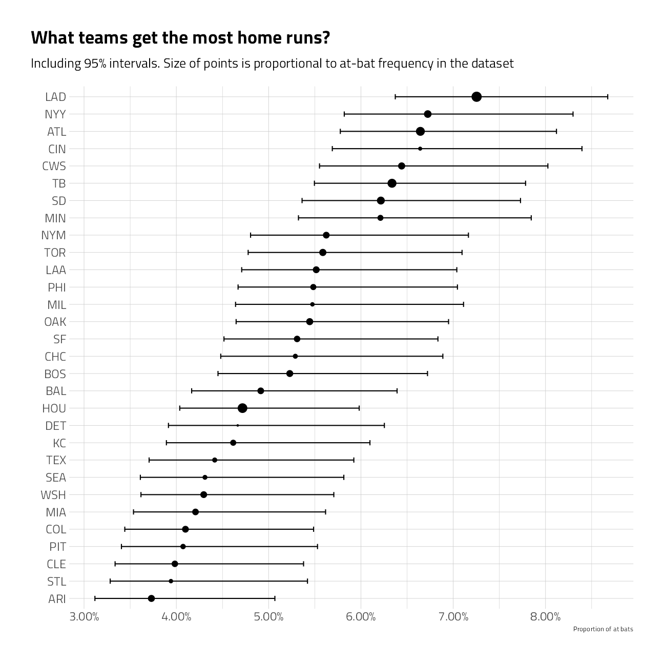
}train_df %>%
group_by(batter_team) %>%
summarize_is_home_run() %>%
mutate(batter_team = fct_reorder(batter_team, pct_is_home_run)) %>%
ggplot(aes(pct_is_home_run, batter_team)) +
geom_point(aes(size = pct)) +
geom_errorbarh(aes(xmin = low, xmax = high), height = .3) +
scale_size_continuous(
labels = percent,
guide = "none",
range = c(.5, 4)
) +
scale_x_continuous(labels = percent) +
labs(
x = "Proportion of at bats",
y = "",
title = "What teams get the most home runs?",
subtitle = "Including 95% intervals. Size of points is proportional to at-bat frequency in the dataset"
)
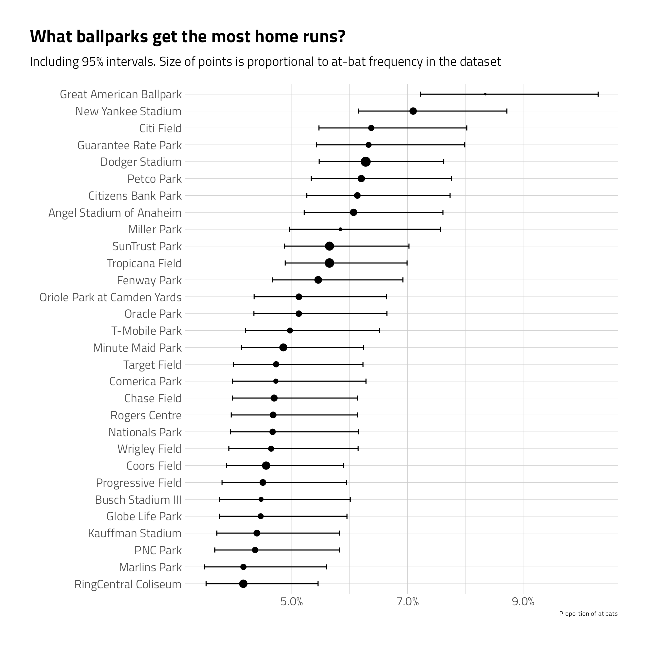
train_df %>%
  group_by(name) %>%
  summarize_is_home_run() %>%
  mutate(name = fct_reorder(name, pct_is_home_run)) %>%
  ggplot(aes(pct_is_home_run, name)) +
  geom_point(aes(size = pct)) +
  geom_errorbarh(aes(xmin = low, xmax = high), height = .3) +
  scale_size_continuous(
    labels = percent,
    guide = "none",
    range = c(.5, 4)
  ) +
  scale_x_continuous(labels = percent) +
  labs(
    x = "Proportion of at bats",
    y = "",
    title = "What ballparks get the most home runs?",
    subtitle = "Including 95% intervals. Size of points is proportional to at-bat frequency in the dataset"
  )
train_df %>%
  group_by(inning = pmin(inning, 10)) %>%
  summarize_is_home_run() %>%
  arrange(inning) %>%
  #  mutate(inning = fct_reorder(inning, -as.numeric(inning))) %>%
  ggplot(aes(pct_is_home_run, inning)) +
  geom_point(aes(size = pct), show.legend = FALSE) +
  geom_line(orientation = "y") +
  geom_ribbon(aes(xmin = low, xmax = high), alpha = .2) +
  scale_x_continuous(labels = percent) +
  scale_y_continuous(breaks = 1:10, labels = c(1:9, "10+")) +
  labs(
    x = "Proportion of at bats that are home runs",
    y = "",
    title = "What innings get the most home runs?",
    subtitle = "Including 95% intervals. Size of points is proportional to at-bat frequency in the dataset"
  ) +
  theme(
    legend.position = c(0.8, 0.8),
    legend.background = element_rect(color = "white")
  )
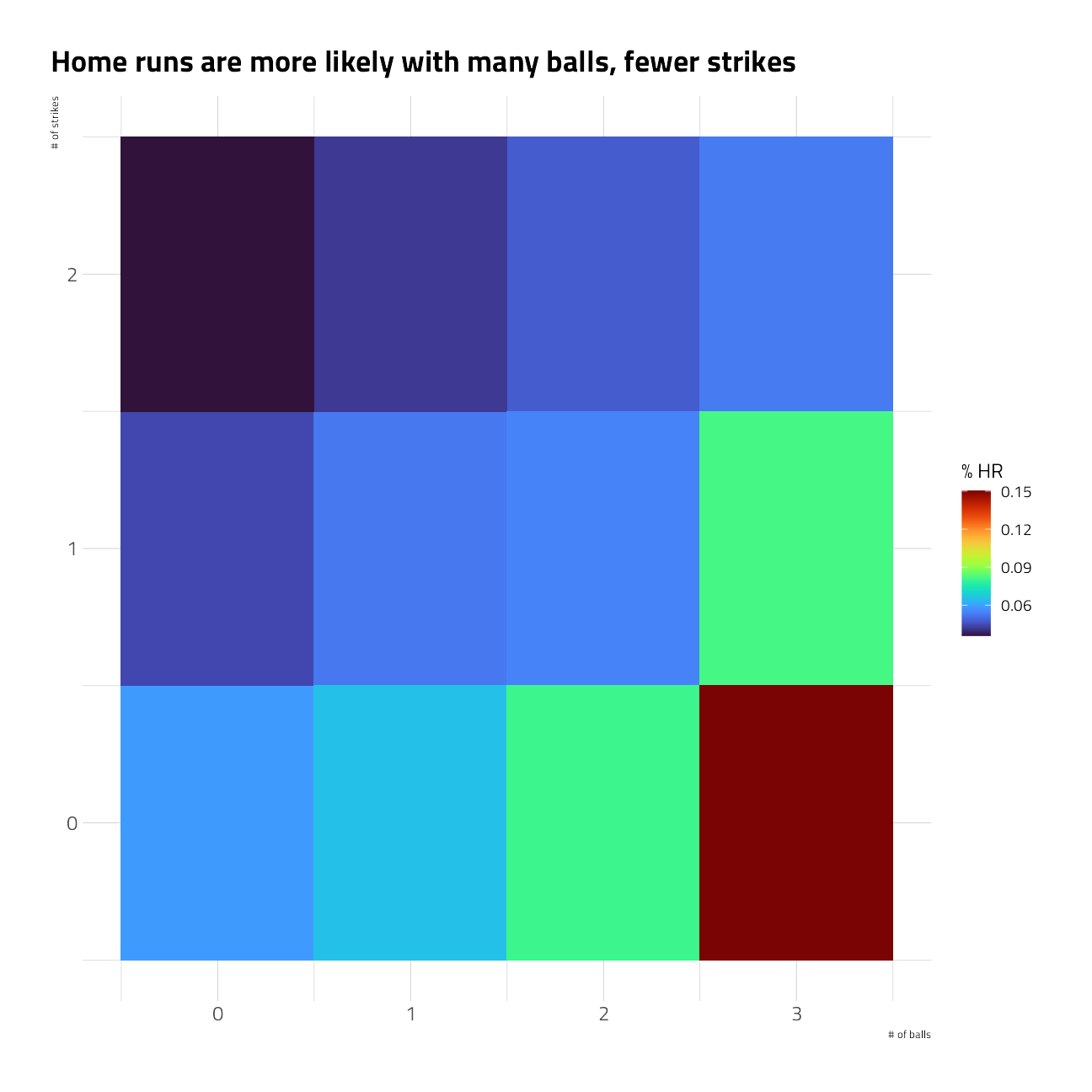
train_df %>%
  group_by(balls, strikes) %>%
  summarize_is_home_run() %>%
  mutate(pitch_count = paste0(strikes, "-", balls)) %>%
  ggplot(aes(pct_is_home_run, pitch_count)) +
  geom_point(aes(size = pct)) +
  geom_errorbarh(aes(xmin = low, xmax = high), height = .3) +
  scale_size_continuous(
    labels = percent,
    guide = "none",
    range = c(1, 7)
  ) +
  scale_x_continuous(labels = percent) +
  geom_text(
    data = . %>% filter(pitch_count == "2-3"),
    label = "Home runs are likely with a full count",
    check_overlap = TRUE,
    nudge_y = -0.3
  ) +
  geom_text(
    data = . %>% filter(pitch_count == "0-3"),
    label = "Home runs are likely with the batter ahead",
    check_overlap = TRUE,
    nudge_y = -0.3
  ) +
  labs(
    x = "Proportion of at bats",
    y = "Strikes - Balls",
    title = "At what levels of pitch count are there more home runs?",
    subtitle = "Including 95% intervals. Size of points is proportional to at-bat frequency in the dataset"
  )
train_df %>%
  group_by(balls, strikes) %>%
  summarize_is_home_run() %>%
  ggplot(aes(balls, strikes, fill = pct_is_home_run)) +
  geom_tile() +
  labs(
    x = "# of balls",
    y = "# of strikes",
    title = "Home runs are more likely with many balls, fewer strikes",
    fill = "% HR"
  )
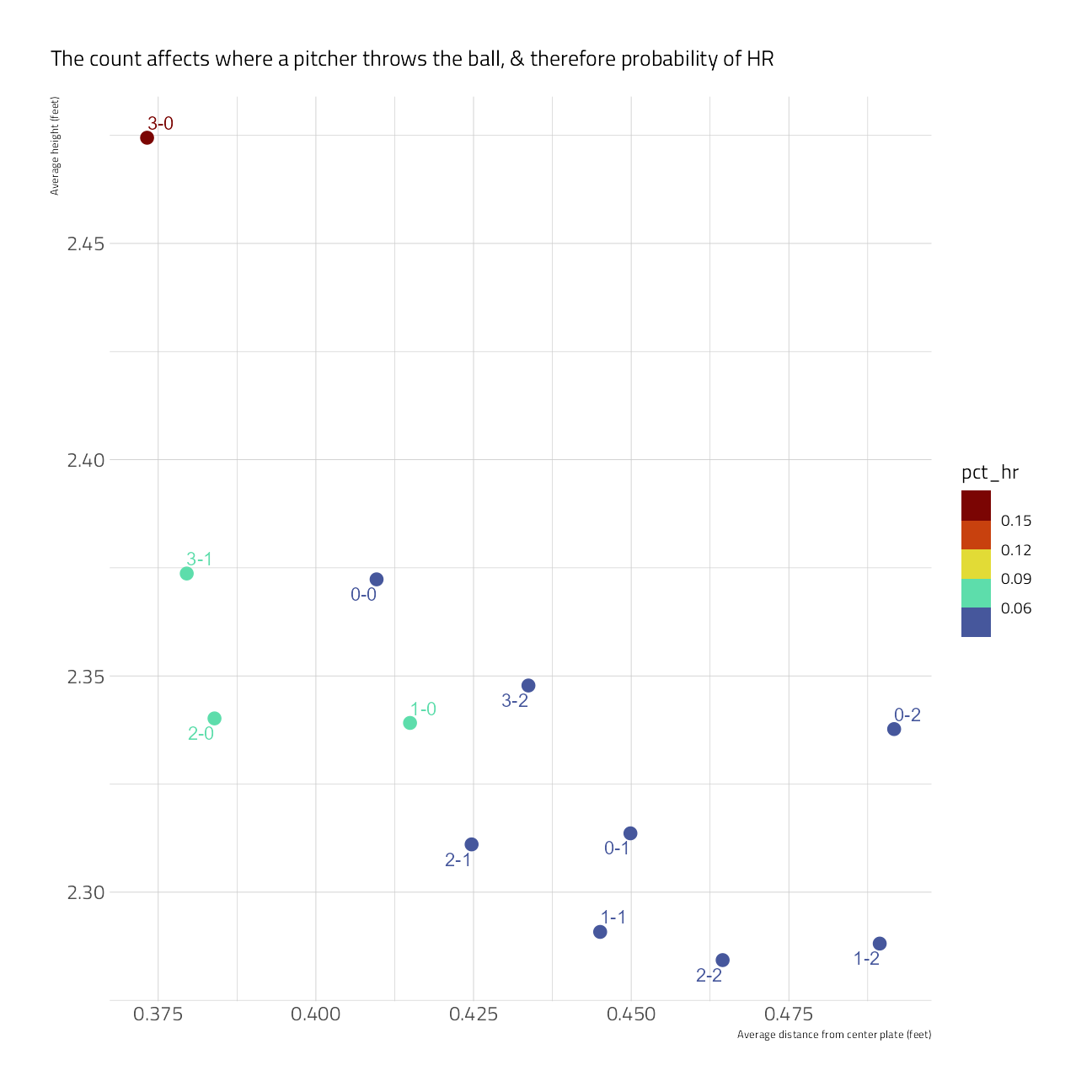
train_df %>%
  group_by(balls, strikes) %>%
  summarize(
    pct_hr = mean(is_home_run == "yes"),
    avg_height = mean((plate_z), na.rm = TRUE),
    avg_abs_distance_center = mean(abs(plate_x), na.rm = TRUE),
    .groups = "drop"
  ) %>%
  mutate(count = paste0(balls, "-", strikes)) %>%
  ggplot(aes(avg_abs_distance_center,
    avg_height,
    color = pct_hr
  )) +
  geom_point(size = 5, shape = 20) +
  scale_color_viridis_b(option = "H") +
  ggrepel::geom_text_repel(aes(label = count)) +
  labs(
    x = "Average distance from center plate (feet)",
    y = "Average height (feet)",
    fill = "% home run",
    subtitle = "The count affects where a pitcher throws the ball, & therefore probability of HR"
  )
train_df %>%
  group_by(bb_type) %>%
  summarize_is_home_run() %>%
  filter(!is.na(bb_type)) %>%
  ggplot(aes(bb_type, pct_is_home_run)) +
  geom_col() +
  scale_y_continuous(labels = percent) +
  labs(
    y = "% home run",
    subtitle = "Ground balls and pop-ups are (literally) *never* home runs. Fly balls often are"
  ) +
  theme(panel.grid.major.x = element_blank())
train_df %>%
  group_by(bearing) %>%
  summarize_is_home_run() %>%
  mutate(bearing = fct_relevel(bearing, "right", "center", "left")) %>%
  ggplot(aes(pct_is_home_run, bearing)) +
  geom_point(aes(size = pct)) +
  geom_errorbarh(aes(xmin = low, xmax = high), height = .3) +
  scale_size_continuous(
    labels = percent,
    guide = "none",
    range = c(.5, 4)
  ) +
  scale_x_continuous(labels = percent) +
  labs(
    x = "Proportion of at bats",
    y = "",
    title = "What bearings get the most home runs?",
    subtitle = "Including 95% intervals. Size of points is proportional to at-bat frequency in the dataset"
  ) +
  theme(panel.grid.major.y = element_blank())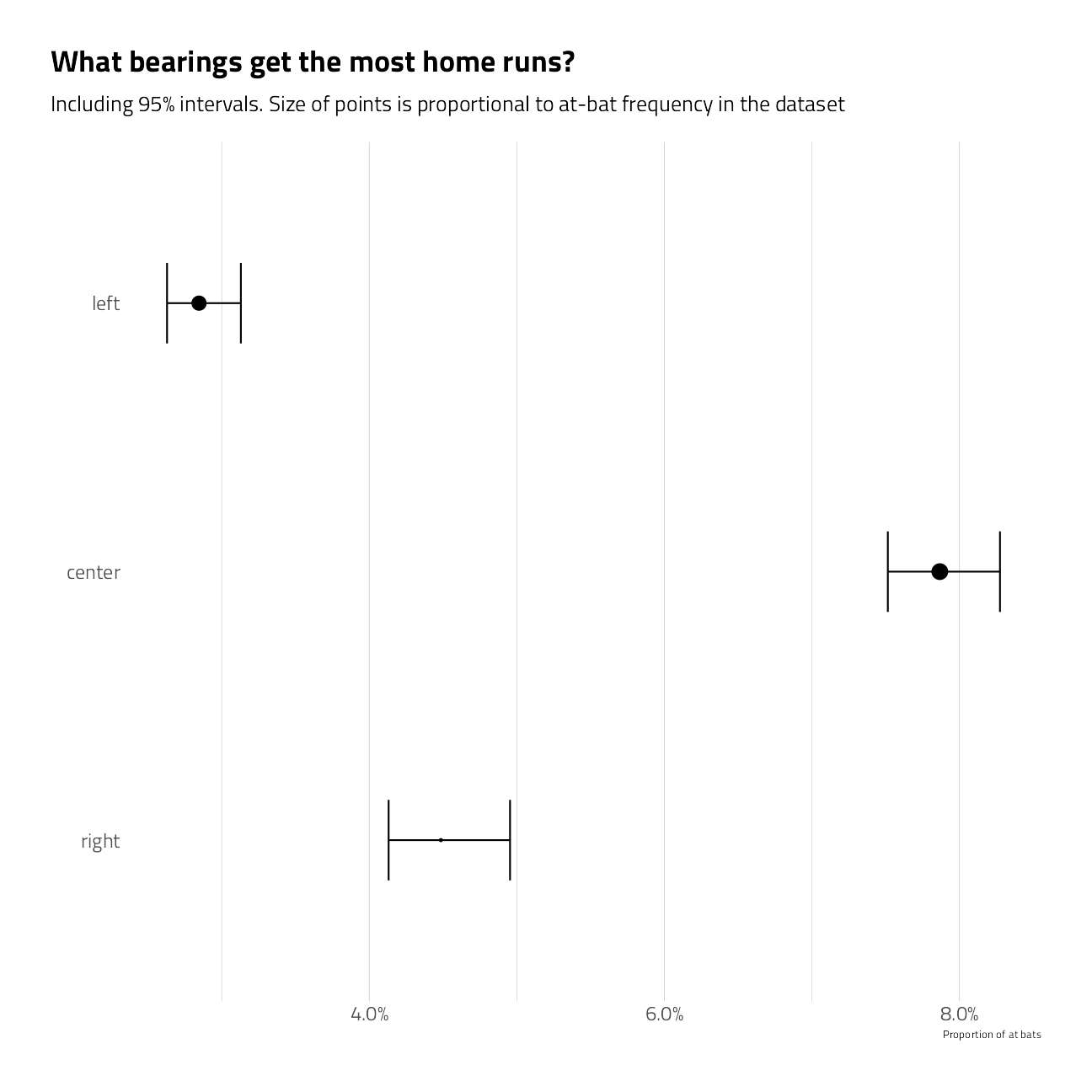
train_df %>%
  group_by(pitch_name) %>%
  summarize_is_home_run() %>%
  filter(n > 10) %>%
  mutate(pitch_name = fct_reorder(pitch_name, pct_is_home_run)) %>%
  ggplot(aes(pct_is_home_run, pitch_name)) +
  geom_point(aes(size = pct)) +
  geom_errorbarh(aes(xmin = low, xmax = high), height = .3) +
  scale_size_continuous(
    labels = percent,
    guide = "none",
    range = c(.5, 4)
  ) +
  scale_x_continuous(labels = percent) +
  labs(
    x = "Proportion of at bats",
    y = "",
    title = "What pitch names get the most home runs?",
    subtitle = "Including 95% intervals. Size of points is proportional to at-bat frequency in the dataset"
  ) +
  theme(panel.grid.major.y = element_blank())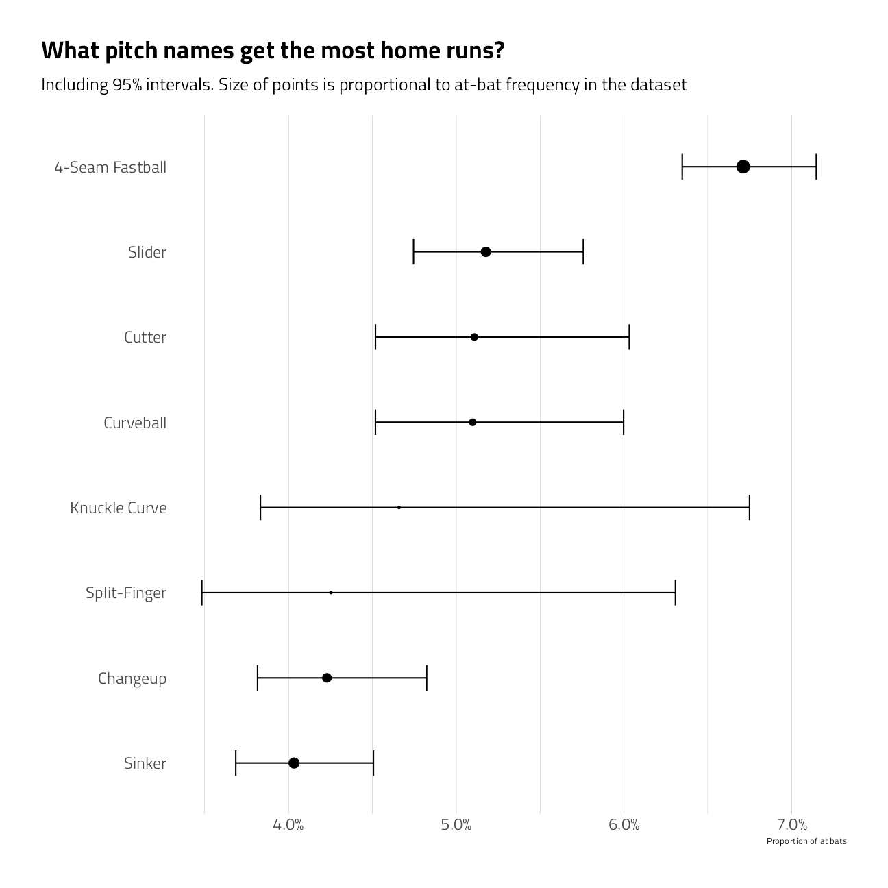
train_df %>%
  count(is_home_run) %>%
  ggplot(aes(n, is_home_run, fill = is_home_run)) +
  geom_col(show.legend = FALSE) +
  scale_fill_viridis_d(option = "H") +
  labs(subtitle = "There are a lot more non-home runs in this dataset than home runs.
", fill = NULL, y = NULL)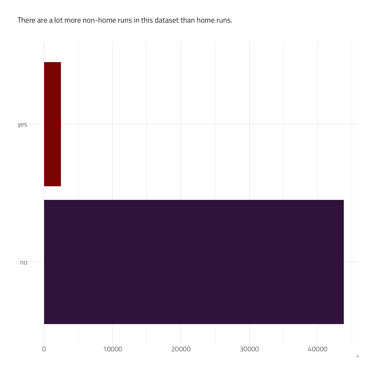
Time series
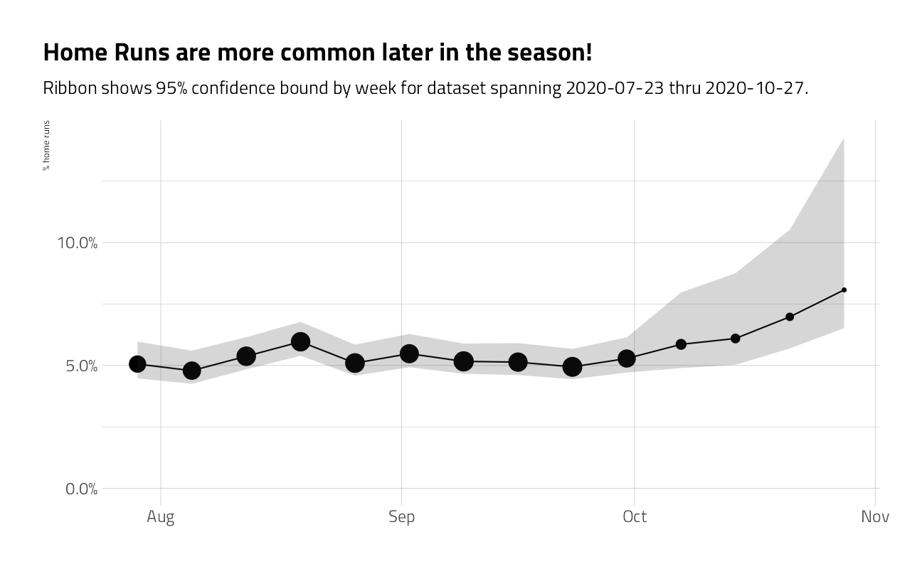
train_df %>%
  group_by(week = as.Date("2020-01-01") + lubridate::week(game_date) * 7) %>%
  summarize_is_home_run() %>%
  ggplot(aes(week, pct_is_home_run)) +
  geom_point(aes(size = n)) +
  geom_line() +
  geom_ribbon(aes(ymin = low, ymax = high), alpha = .2) +
  expand_limits(y = 0) +
  scale_x_date(
    date_labels = "%b",
    date_breaks = "month",
    minor_breaks = NULL
  ) +
  scale_y_continuous(labels = percent) +
  scale_size_continuous(guide = "none") +
  labs(
    x = NULL,
    y = "% home runs",
    title = "Home Runs are more common later in the season!",
    subtitle = glue::glue("Ribbon shows 95% confidence bound by week for dataset spanning { min(train_df$game_date) } thru { max(train_df$game_date) }.")
  )
train_df %>%
  group_by(name, lf_dim, cf_dim, rf_dim, lf_w, cf_w, rf_w) %>%
  summarize_is_home_run() %>%
  pivot_longer(cols = lf_dim:rf_w, names_to = "metric", values_to = "value") %>%
  ggplot(aes(value, pct_is_home_run)) +
  geom_point() +
  geom_text(aes(label = name),
    check_overlap = TRUE,
    vjust = 1,
    hjust = 1
  ) +
  facet_wrap(~metric, scales = "free_x") +
  labs(subtitle = "No trends where a park's dimensions are statistically significant")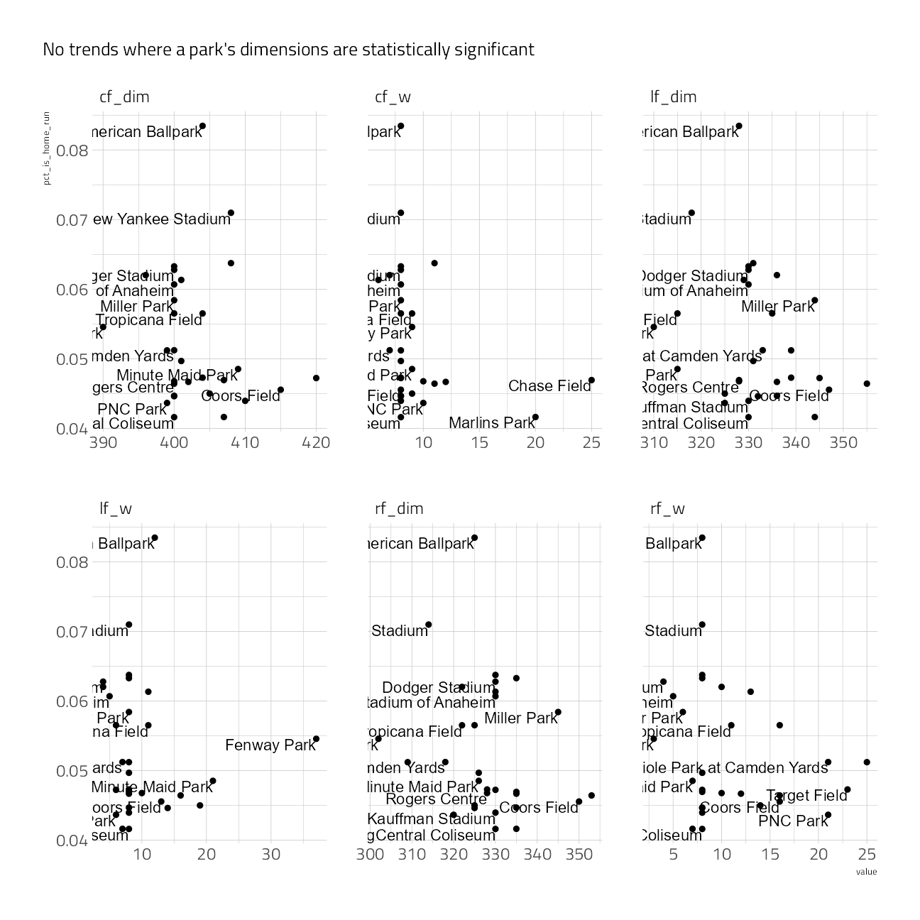
train_df %>%
  group_by(name, lf_dim, cf_dim, rf_dim, lf_w, cf_w, rf_w) %>%
  summarize_is_home_run() %>%
  pivot_longer(cols = lf_dim:rf_w, names_to = "metric", values_to = "value") %>%
  group_by(metric) %>%
  summarize(tidy(cor.test(value, pct_is_home_run)))
train_df %>%
select(is_home_run, plate_x:launch_angle) %>%
pivot_longer(cols = -is_home_run, names_to = "feature", values_to = "value") %>%
ggplot(aes(value, fill = is_home_run)) +
geom_density(alpha = .5) +
scale_fill_viridis_d(option = "H") +
facet_wrap(~feature, scales = "free") +
labs(
subtitle = "There's a sweet spot of launch angle & speed where home runs happen",
fill = "Home Run"
) +
theme(legend.position = c(0.8, 0.3))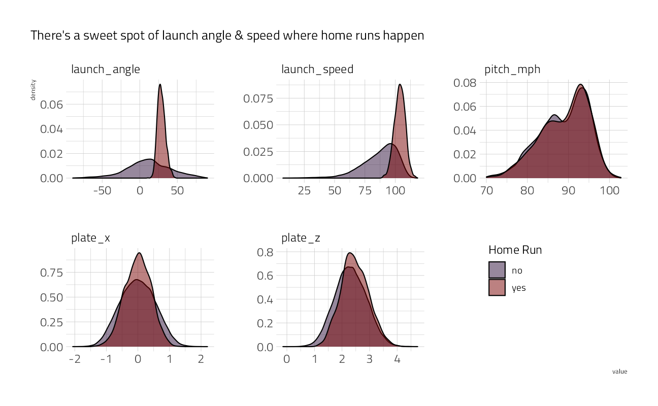
train_df %>%
  group_by(
    launch_angle_bucket = round(launch_angle * 2, -1) / 2,
    launch_speed_bucket = round(launch_speed * 2, -1) / 2
  ) %>%
  summarize_is_home_run() %>%
  filter(n >= 30) %>%
  filter(complete.cases(.)) %>%
  ggplot(aes(launch_speed_bucket, launch_angle_bucket, fill = pct_is_home_run)) +
  geom_tile() +
  scale_fill_viridis_c(option = "H", labels = scales::percent) +
  labs(
    x = "Launch Speed",
    y = "Launch Angle",
    title = "There is a sweet spot of high speed + moderate angle",
    subtitle = "Rounded to the nearest 5 on each scale; no buckets shown with <30 data points",
    fill = "% HR"
  )
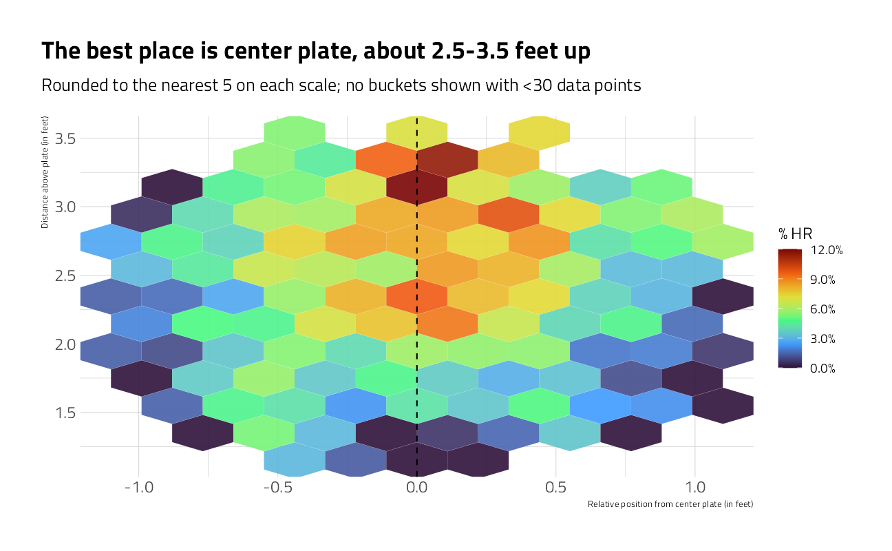
train_df %>%
  group_by(
    plate_x = round(plate_x, 1),
    plate_z = round(plate_z, 1)
  ) %>%
  summarize_is_home_run() %>%
  filter(n >= 30) %>%
  filter(complete.cases(.)) %>%
  ggplot(aes(plate_x, plate_z, z = pct_is_home_run)) +
  stat_summary_hex(alpha = 0.9, bins = 10) +
  scale_fill_viridis_c(option = "H", labels = scales::percent) +
  geom_vline(xintercept = 0, lty = 2) +
  labs(
    x = "Relative position from center plate (in feet)",
    y = "Distance above plate (in feet)",
    title = "The best place is center plate, about 2.5-3.5 feet up",
    subtitle = "Rounded to the nearest 5 on each scale; no buckets shown with <30 data points",
    fill = "% HR"
  )
Machine Learning: Random Forest
Let’s run models in two steps. The first is a simple, fast shallow random forest, to confirm that the model will run and observe feature importance scores. The second will use xgboost. Both use the basic recipe preprocessor for now.
The recipe
To move quickly I started with this basic recipe.
basic_rec <-
  recipe(
    is_home_run ~ bb_type +
      pitch_mph +
      launch_speed +
      launch_angle +
      plate_x +
      plate_z +
      is_batter_lefty +
      is_pitcher_lefty,
    data = train_df
  )
Dataset for modeling
basic_rec %>%
  #  finalize_recipe(list(num_comp = 2)) %>%
  prep() %>%
  juice()
Cross Validation
We will use 5-fold cross validation and stratify on the outcome to build models that are less likely to over-fit the training data.
Proper business modeling practice would holdout a sample from training entirely for assessing model performance. I’ve made an exception here for Kaggle.
set.seed(2021)

(folds <- vfold_cv(train_df, v = 5, strata = is_home_run))
Model Specification
This first model is a bagged tree, where the number of predictors to consider for each split of a tree (i.e., mtry) equals the number of all available predictors. The min_n of 10 means that each tree branch of the 50 decision trees built have at least 10 observations. As a result, the decision trees in the ensemble all are relatively shallow.
(bag_spec <-
  bag_tree(min_n = 10) %>%
  set_engine("rpart", times = 50) %>%
  set_mode("classification"))
Bagged Decision Tree Model Specification (classification)
Main Arguments:
cost_complexity = 0
min_n = 10
Engine-Specific Arguments:
times = 50
Computational engine: rpart Parallel backend
To speed up computation we will use a parallel backend.
all_cores <- parallelly::availableCores(omit = 1)
all_cores
system
11 future::plan("multisession", workers = all_cores) # on WindowsFit and Variable Importance
Lets make a cursory check of the recipe and variable importance, which comes out of rpart for free. This workflow also handles factors without dummies.
bag_wf <-
workflow() %>%
add_recipe(basic_rec) %>%
add_model(bag_spec)
bag_fit <- parsnip::fit(bag_wf, data = train_df)
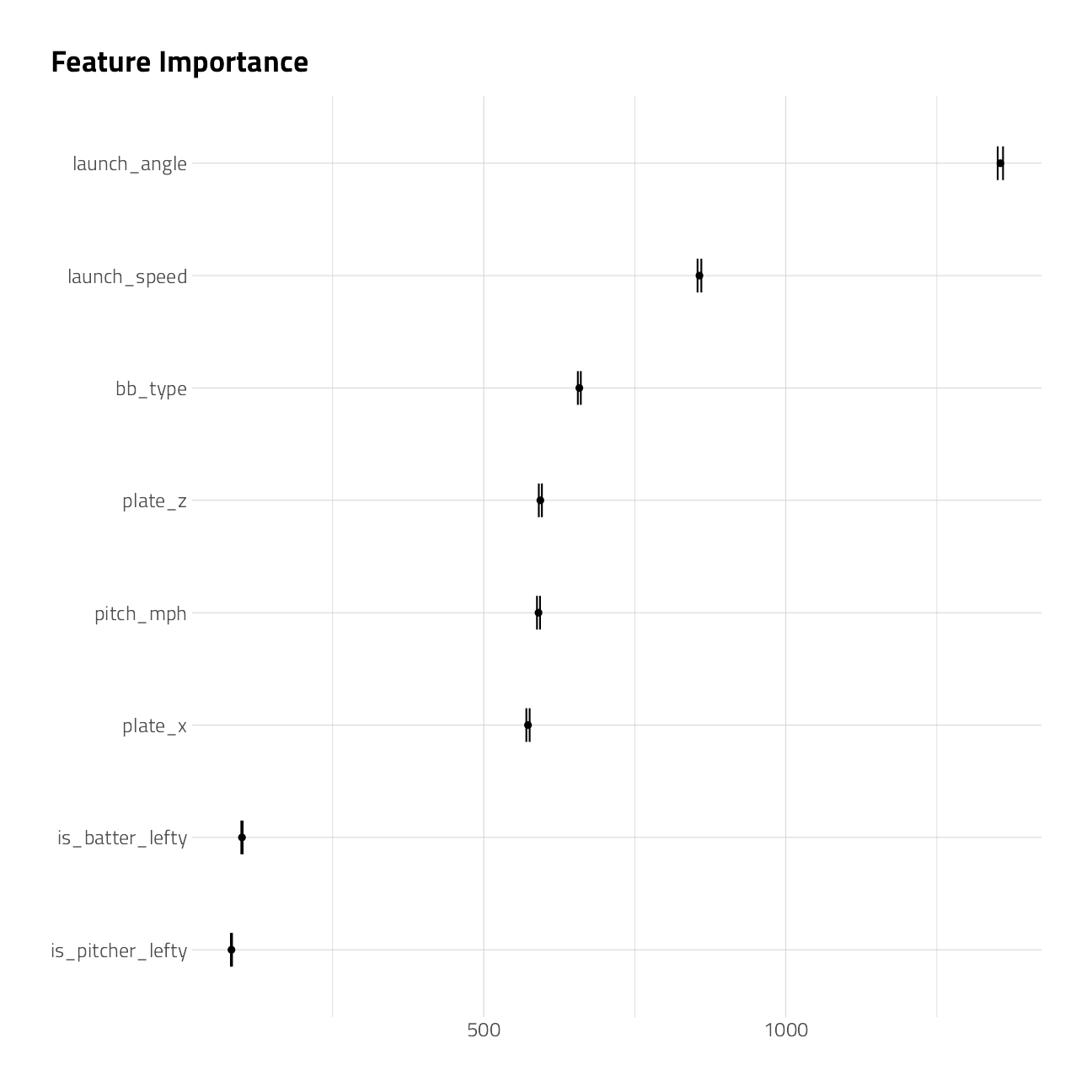
extract_fit_parsnip(bag_fit)$fit$imp %>%
mutate(term = fct_reorder(term, value)) %>%
ggplot(aes(value, term)) +
geom_point() +
geom_errorbarh(aes(
xmin = value - `std.error` / 2,
xmax = value + `std.error` / 2
),
height = .3
) +
labs(
title = "Feature Importance",
x = NULL, y = NULL
)
augment(bag_fit, train_df) %>%
  select(is_home_run, .pred_yes) %>%
  mn_log_loss(truth = is_home_run, estimate = .pred_yes, event_level = "second")
Wow, that’s not too shabby. Of course, this may have overfitted. Let’s bank this first submission to Kaggle as-is, and work more with xgboost to do better.
submission <- augment(bag_fit, holdout_df) %>%
  select(bip_id, is_home_run = .pred_yes)

write_csv(submission, file = path_export)
shell(glue::glue('kaggle competitions submit -c { competition_name } -f { path_export } -m "First model"'))Machine Learning: XGBoost Model 1
Model Specification
Let’s start with a boosted model that runs fast and gives an early indication of which hyperparameters make the most difference in model performance.
(xgboost_spec <- boost_tree(
  trees = tune(),
  min_n = tune(),
  learn_rate = tune(),
  tree_depth = tune(),
  stop_iter = 20
) %>%
  set_engine("xgboost", validation = 0.2) %>%
  set_mode("classification"))
Boosted Tree Model Specification (classification)
Main Arguments:
trees = tune()
min_n = tune()
tree_depth = tune()
learn_rate = tune()
stop_iter = 20
Engine-Specific Arguments:
validation = 0.2
Computational engine: xgboost Tuning and Performance
We will use the basic recipe from above and simply dummy the categorical predictors.
second_rec <-
  recipe(
    is_home_run ~ bb_type +
      pitch_mph +
      launch_speed +
      launch_angle +
      plate_x +
      plate_z +
      is_batter_lefty +
      is_pitcher_lefty,
    data = train_df
  ) %>%
  step_unknown(all_nominal_predictors()) %>%
  step_dummy(all_nominal_predictors()) %>%
  step_impute_linear(launch_angle, launch_speed,
    impute_with = imp_vars(plate_x, plate_z, pitch_mph)
  ) %>%
  step_nzv(all_predictors())
cv_res_xgboost <-
workflow() %>%
add_recipe(second_rec) %>%
add_model(xgboost_spec) %>%
tune_grid(
resamples = folds,
grid = 7,
metrics = mset
)autoplot(cv_res_xgboost)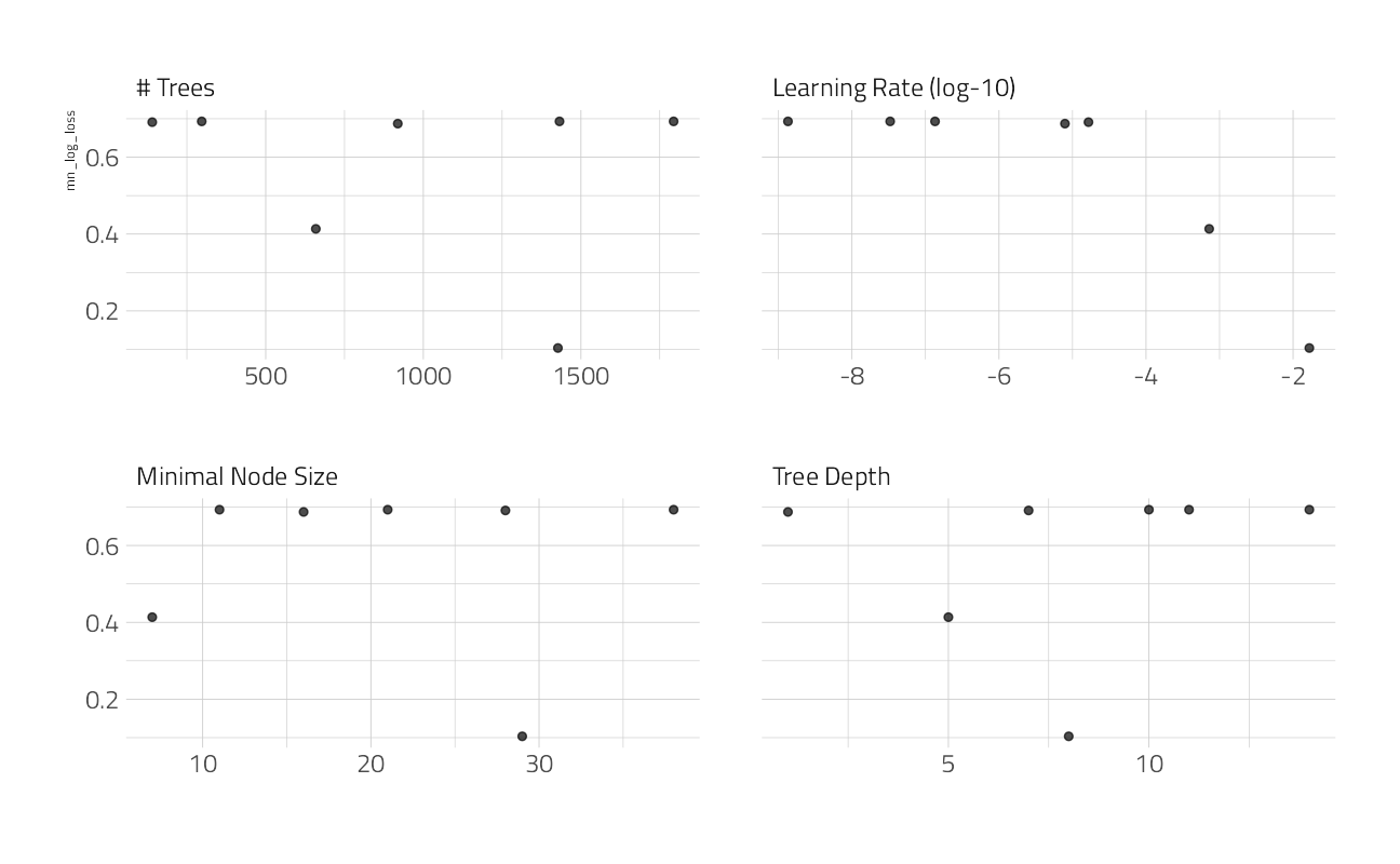
collect_metrics(cv_res_xgboost) %>%
  arrange(mean)
xgb_wf_best <-
workflow() %>%
add_recipe(second_rec) %>%
add_model(xgboost_spec) %>%
finalize_workflow(select_best(cv_res_xgboost))
fit_best <- xgb_wf_best %>%
parsnip::fit(data = train_df)[21:03:07] WARNING: amalgamation/../src/learner.cc:1095: Starting in XGBoost 1.3.0, the default evaluation metric used with the objective 'binary:logistic' was changed from 'error' to 'logloss'. Explicitly set eval_metric if you'd like to restore the old behavior.augment(fit_best, train_df) %>%
select(is_home_run, .pred_yes) %>%
mn_log_loss(
truth = is_home_run,
estimate = .pred_yes,
event_level = "second"
)On training data, this log loss figure is not an improvement. I am going to attempt to post this second submission to Kaggle anyway, and work more with xgboost and a more advanced recipe to do better.
submission <- augment(fit_best, holdout_df) %>%
  select(bip_id, is_home_run = .pred_yes)

write_csv(submission, file = path_export)
shell(glue::glue('kaggle competitions submit -c { competition_name } -f { path_export } -m "Second model"'))Machine Learning: XGBoost Model 2
Let’s use what we learned above to set a more advanced recipe. This time, let’s also try thetune_race_anova technique for skipping the parts of the grid search that do not perform well.
Advanced Recipe
advanced_rec <-
  recipe(
    is_home_run ~ bb_type + pitch_mph + launch_speed + launch_angle +
      plate_x + plate_z + inning + balls + strikes +
      is_pitcher_lefty + is_batter_lefty +
      game_date + home_team + batter_team + bearing,
    data = train_df
  ) %>%
  step_date(game_date, features = "week", keep_original_cols = FALSE) %>%
  step_mutate(is_home_team = home_team == batter_team) %>%
  step_rm(home_team) %>%
  step_unknown(all_nominal_predictors()) %>%
  step_dummy(all_nominal_predictors()) %>%
  step_impute_linear(launch_angle, launch_speed,
    impute_with = imp_vars(plate_x, plate_z, pitch_mph)
  ) %>%
  step_nzv(all_predictors())
Model Specification
(xgboost_spec <- boost_tree(
  trees = tune(),
  min_n = tune(),
  mtry = tune(),
  learn_rate = 0.01
) %>%
  set_engine("xgboost") %>%
  set_mode("classification"))
Boosted Tree Model Specification (classification)
Main Arguments:
mtry = tune()
trees = tune()
min_n = tune()
learn_rate = 0.01
Computational engine: xgboost Tuning and Performance
cv_res_xgboost <-
  workflow() %>%
  add_recipe(advanced_rec) %>%
  add_model(xgboost_spec) %>%
  tune_race_anova(
    resamples = folds,
    grid = 12,
    control = control_race(
      verbose_elim = TRUE,
      parallel_over = "resamples"
    ),
    metrics = mset
  )
We can visualize how the possible parameter combinations we tried did during the “race.” Notice how we saved a TON of time by not evaluating the parameter combinations that were clearly doing poorly on all the resamples; we only kept going with the good parameter combinations.
plot_race(cv_res_xgboost)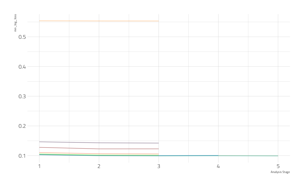
And we can look at the top results
autoplot(cv_res_xgboost)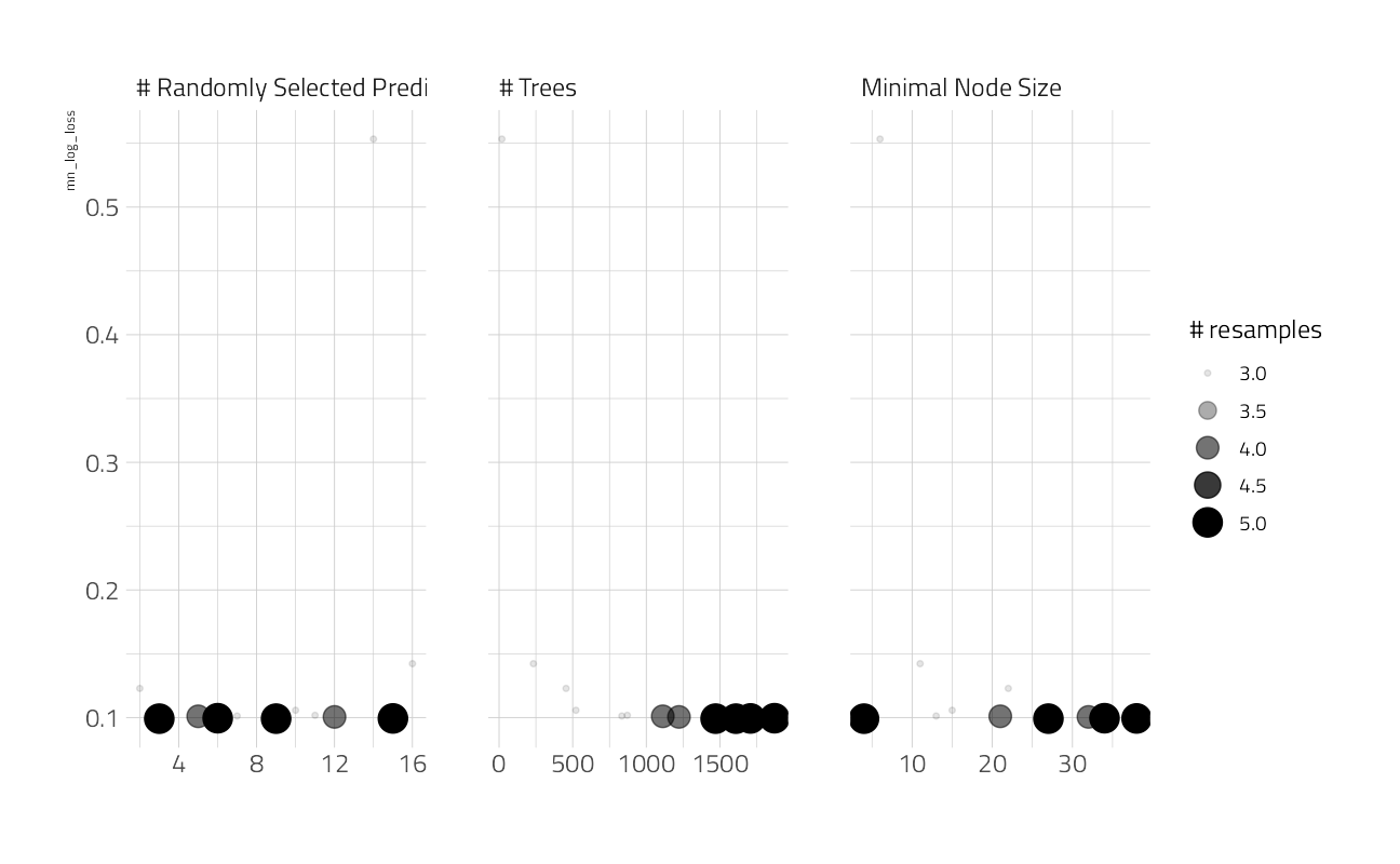
show_best(cv_res_xgboost)The best here is still discouraging. This figure is likely more robust and a better estimate of performance on holdout data. Let’s fit on the entire training set at these hyperparameters to get a single performance estimate on the best model so far.
xgb_wf_best <-
  workflow() %>%
  add_recipe(advanced_rec) %>%
  add_model(xgboost_spec) %>%
  finalize_workflow(select_best(cv_res_xgboost))

fit_best <- xgb_wf_best %>%
  parsnip::fit(data = train_df)
[21:03:32] WARNING: amalgamation/../src/learner.cc:1095: Starting in XGBoost 1.3.0, the default evaluation metric used with the objective 'binary:logistic' was changed from 'error' to 'logloss'. Explicitly set eval_metric if you'd like to restore the old behavior.augment(fit_best, train_df) %>%
select(is_home_run, .pred_yes) %>%
mn_log_loss(truth = is_home_run, estimate = .pred_yes, event_level = "second")Variable Importance
Let’s take a deeper dive into the XGBoost variable importance.
fit_best %>%
  extract_fit_parsnip() %>%
  vip(geom = "point", num_features = 15) +
  labs(
    title = "XGBoost model Variable Importance",
    subtitle = "VIP package"
  )
DALEX Partial Dependence Plots
What is the aggregated effect of the launch_angle feature over 500 examples?
explainer_xgb <- explain_tidymodels(
  fit_best,
  train_df %>% select(-is_home_run),
  as.numeric(train_df$is_home_run)
)
Preparation of a new explainer is initiated
-> model label : workflow ( [33m default [39m )
-> data : 46244 rows 32 cols
-> data : tibble converted into a data.frame
-> target variable : 46244 values
-> predict function : yhat.workflow will be used ( [33m default [39m )
-> predicted values : No value for predict function target column. ( [33m default [39m )
-> model_info : package tidymodels , ver. 0.1.4 , task classification ( [33m default [39m )
-> predicted values : numerical, min = 6.556511e-06 , mean = 0.05292456 , max = 0.9867029
-> residual function : difference between y and yhat ( [33m default [39m )
-> residuals : numerical, min = 0.06649031 , mean = 0.9999904 , max = 1.985391
[32m A new explainer has been created! [39m pdp_angle <- model_profile(explainer_xgb,
N = 500,
variables = "launch_angle"
)
as_tibble(pdp_angle$agr_profiles) %>%
ggplot(aes(`_x_`, `_yhat_`)) +
geom_line(
data = as_tibble(
pdp_angle$cp_profiles
),
aes(launch_angle, group = `_ids_`),
size = 0.5, alpha = 0.1, color = "gray30"
) +
geom_line(size = 1.2, alpha = 0.8, color = "orange") +
labs(x = "Launch Angle", y = "Predicted Home Runs")
What is the aggregated effect of the launch_speed feature over 500 examples?
pdp_speed <- model_profile(explainer_xgb,
  N = 500,
  variables = "launch_speed"
)

as_tibble(pdp_speed$agr_profiles) %>%
  ggplot(aes(`_x_`, `_yhat_`)) +
  geom_line(
    data = as_tibble(
      pdp_speed$cp_profiles
    ),
    aes(launch_speed, group = `_ids_`),
    size = 0.5, alpha = 0.1, color = "gray30"
  ) +
  geom_line(size = 1.2, alpha = 0.8, color = "darkblue") +
  labs(x = "Launch Speed", y = "Predicted Home Runs")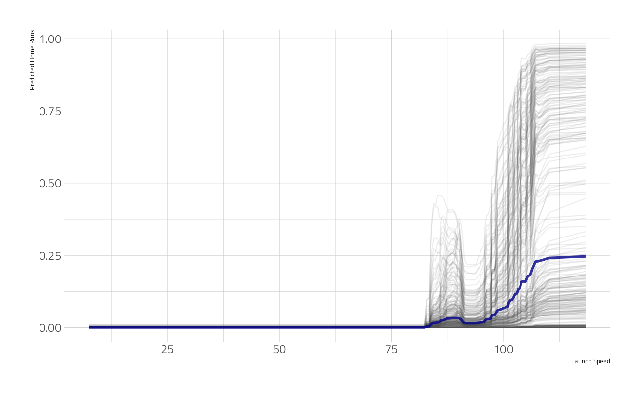
We’re out of time. This will be as good as it gets. Our final submission:
Let’s post this final submission to Kaggle.
submission <- augment(fit_best, holdout_df) %>%
  select(bip_id, is_home_run = .pred_yes)

write_csv(submission, file = path_export)
shell(glue::glue('kaggle competitions submit -c { competition_name } -f { path_export } -m "Final model"'))
sessionInfo()R version 4.1.1 (2021-08-10)
Platform: x86_64-w64-mingw32/x64 (64-bit)
Running under: Windows 10 x64 (build 22000)
Matrix products: default
locale:
[1] LC_COLLATE=English_United States.1252
[2] LC_CTYPE=English_United States.1252
[3] LC_MONETARY=English_United States.1252
[4] LC_NUMERIC=C
[5] LC_TIME=English_United States.1252
attached base packages:
[1] stats graphics grDevices utils datasets methods base
other attached packages:
[1] DALEXtra_2.1.1 DALEX_2.3.0 vip_0.3.2 baguette_0.1.1
[5] themis_0.1.4 finetune_0.1.0 yardstick_0.0.8 workflowsets_0.1.0
[9] workflows_0.2.3 tune_0.1.6 rsample_0.1.0 recipes_0.1.17
[13] parsnip_0.1.7.900 modeldata_0.1.1 infer_1.0.0 dials_0.0.10
[17] scales_1.1.1 broom_0.7.9 tidymodels_0.1.4 hrbrthemes_0.8.0
[21] forcats_0.5.1 stringr_1.4.0 dplyr_1.0.7 purrr_0.3.4
[25] readr_2.0.2 tidyr_1.1.4 tibble_3.1.4 ggplot2_3.3.5
[29] tidyverse_1.3.1 workflowr_1.6.2
loaded via a namespace (and not attached):
[1] utf8_1.2.2 R.utils_2.11.0 reticulate_1.22
[4] tidyselect_1.1.1 grid_4.1.1 pROC_1.18.0
[7] munsell_0.5.0 codetools_0.2-18 ragg_1.1.3
[10] xgboost_1.4.1.1 future_1.22.1 withr_2.4.2
[13] colorspace_2.0-2 highr_0.9 knitr_1.36
[16] rstudioapi_0.13 Rttf2pt1_1.3.8 listenv_0.8.0
[19] labeling_0.4.2 git2r_0.28.0 TeachingDemos_2.12
[22] farver_2.1.0 bit64_4.0.5 DiceDesign_1.9
[25] rprojroot_2.0.2 mlr_2.19.0 parallelly_1.28.1
[28] vctrs_0.3.8 generics_0.1.0 ipred_0.9-12
[31] xfun_0.26 R6_2.5.1 doParallel_1.0.16
[34] lhs_1.1.3 cachem_1.0.6 assertthat_0.2.1
[37] vroom_1.5.5 promises_1.2.0.1 nnet_7.3-16
[40] gtable_0.3.0 Cubist_0.3.0 globals_0.14.0
[43] timeDate_3043.102 rlang_0.4.11 BBmisc_1.11
[46] systemfonts_1.0.2 splines_4.1.1 butcher_0.1.5
[49] extrafontdb_1.0 hexbin_1.28.2 earth_5.3.1
[52] checkmate_2.0.0 yaml_2.2.1 reshape2_1.4.4
[55] modelr_0.1.8 backports_1.2.1 httpuv_1.6.3
[58] extrafont_0.17 usethis_2.0.1 inum_1.0-4
[61] tools_4.1.1 lava_1.6.10 ellipsis_0.3.2
[64] jquerylib_0.1.4 Rcpp_1.0.7 plyr_1.8.6
[67] parallelMap_1.5.1 rpart_4.1-15 ParamHelpers_1.14
[70] viridis_0.6.1 ggrepel_0.9.1 haven_2.4.3
[73] fs_1.5.0 here_1.0.1 furrr_0.2.3
[76] unbalanced_2.0 magrittr_2.0.1 data.table_1.14.2
[79] reprex_2.0.1 RANN_2.6.1 GPfit_1.0-8
[82] mvtnorm_1.1-2 whisker_0.4 R.cache_0.15.0
[85] ROSE_0.0-4 hms_1.1.1 evaluate_0.14
[88] readxl_1.3.1 gridExtra_2.3 shape_1.4.6
[91] compiler_4.1.1 ingredients_2.2.0 crayon_1.4.1
[94] R.oo_1.24.0 htmltools_0.5.2 later_1.3.0
[97] tzdb_0.1.2 Formula_1.2-4 libcoin_1.0-9
[100] lubridate_1.7.10 DBI_1.1.1 dbplyr_2.1.1
[103] MASS_7.3-54 rappdirs_0.3.3 Matrix_1.3-4
[106] cli_3.0.1 C50_0.1.5 R.methodsS3_1.8.1
[109] parallel_4.1.1 gower_0.2.2 pkgconfig_2.0.3
[112] xml2_1.3.2 foreach_1.5.1 bslib_0.3.0
[115] hardhat_0.1.6 plotmo_3.6.1 prodlim_2019.11.13
[118] rvest_1.0.1 snakecase_0.11.0 digest_0.6.28
[121] janitor_2.1.0 rmarkdown_2.11 cellranger_1.1.0
[124] fastmatch_1.1-3 gdtools_0.2.3 lifecycle_1.0.1
[127] jsonlite_1.7.2 viridisLite_0.4.0 lime_0.5.2
[130] fansi_0.5.0 pillar_1.6.3 lattice_0.20-44
[133] fastmap_1.1.0 httr_1.4.2 plotrix_3.8-2
[136] survival_3.2-11 glue_1.4.2 conflicted_1.0.4
[139] FNN_1.1.3 png_0.1-7 iterators_1.0.13
[142] bit_4.0.4 glmnet_4.1-2 class_7.3-19
[145] stringi_1.7.5 sass_0.4.0 rematch2_2.1.2
[148] textshaping_0.3.5 partykit_1.2-15 styler_1.6.2
[151] future.apply_1.8.1